Our team worked on a project for Lighttown Speakers, a public speaking club in Eindhoven.
The project included reworking the content strategy, creating needs to promote the club and
designing a website, since they didn't have a suitable one yet.
Please click on the images to expand.
For the marketing portion of this project, Lighttown Speakers wanted to appeal more to other businesses so that they could make use of their public speaking workshops.
That's why a variety of analysis were done, in order to come up with a valuable marketing plan.
Some of the subjects that were analyzed were: B2B marketing, competitors, trends and the target audience.
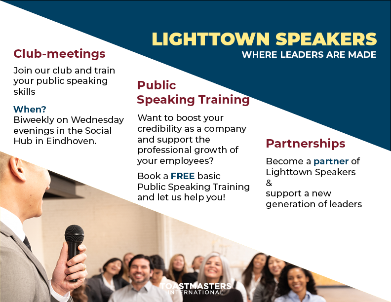
My contribution to the marketing of our client was to design a brand-new logo and a pamphlet as a way to communicate with other brands and businesses.
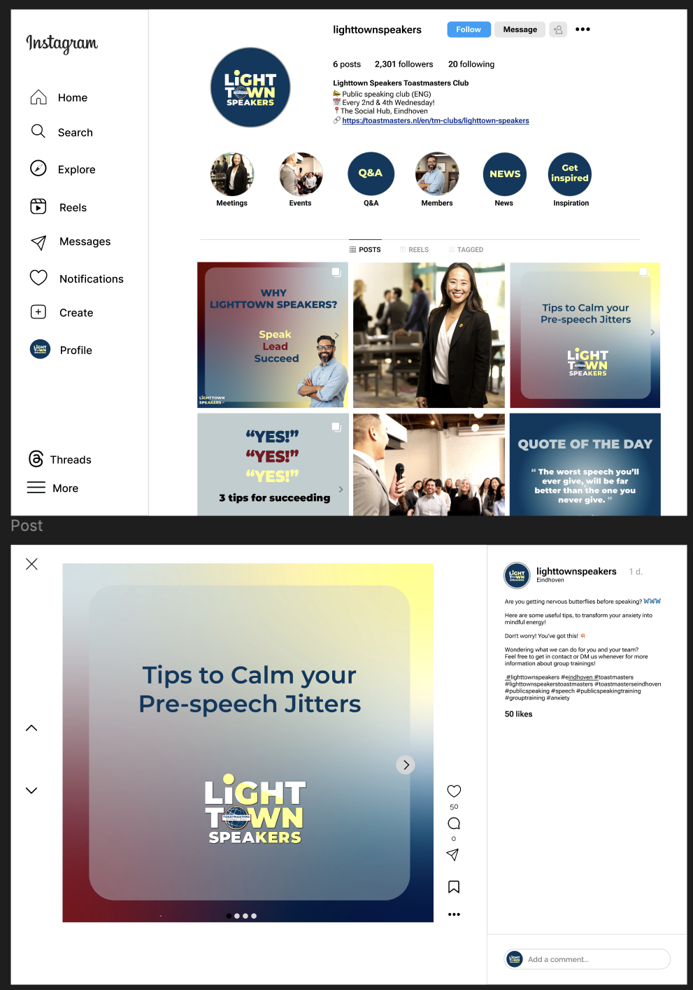
I also made an Instagram account layout design and example posts to help them explore social media more.
During the UX phase of this project, team members and I made wireframes incorporating the previous analysis. Below you can find the wireframes and the prototype that I made during this project. I included a ribbon banner on the homepage to ensure the next event was easy to find, because it was not obvious before while it is important information. Also, becoming a member to the club was a difficult task on their previous "webpage", which is why I included a CTA button to encourage behaviour. The team wanted to include an easter egg for a fun little interaction, so a member spotlight seemed like a good way to do this. Having a member spotlight would also make the club seem more approachable and less formal, which helped with the overall goal for this website. Lighttown Speakers had different badges that were meant to be earned while attending of the meetings, which helped to gain a better overview of the trainig itself. This is why I included the badges on the website. A user test was done with the client and teachers. They were given certain tasks and we observed their behaviour and answered questions without influencing their behaviour. We analyzed the findings and iterated on them. The initial idea for the membership webpage was to have 2 different forms, but it seemed rather crowded and was not very intuïtive. We concluded that one main contact form would be a better design choice.
The developement portion was the final stage of our project. Click on the image below to open the final website.